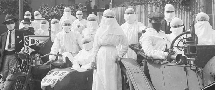
COVID-19 state of play – ‘I’ve been to cities that never close down’?
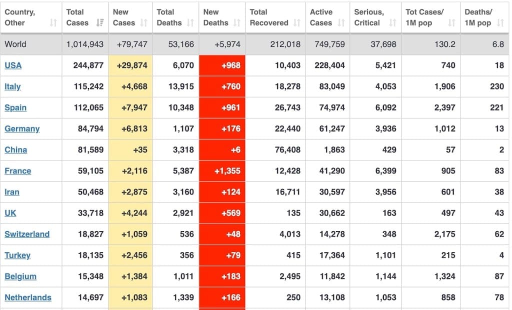
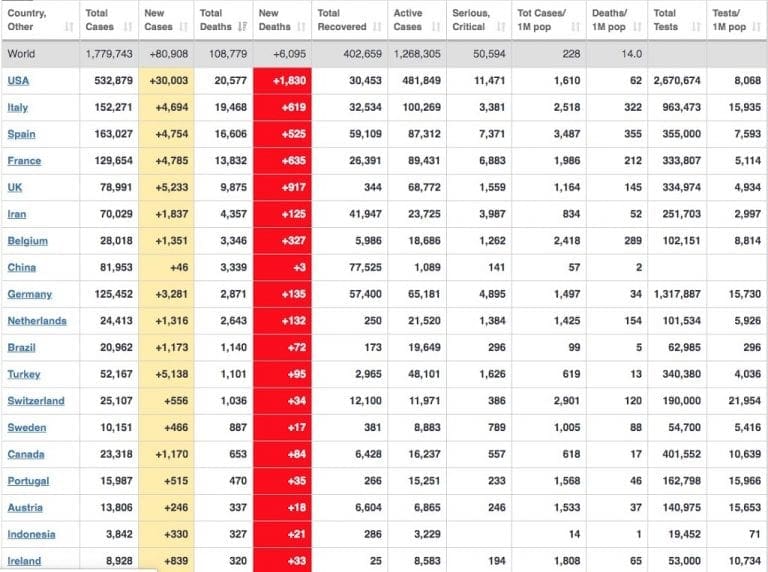
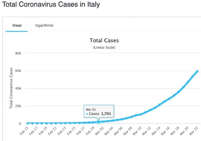
The image above shows results for countries at the top of the cases table on 2 April 2020. The world cases passed 1 million and deaths 53,000. Red and yellow columns are ‘new figures for the day’. The terrible day shown by France (1,355 new deaths was an aberration because 884 deaths that had occurred in nursing homes were suddenly added to the dead total.) It is not looking good. When I look at the graphs for the US, it appears that the US will have at least half a million (probably a million) cases. Its death curve is still accelerating with no end in sight. Italy might top out at 150,000 cases and 20,000 deaths – indicating a 13.5% death rate of those with known infections. (That might indicate that Italy is a long way from finding all those infected – although Italy is now close to the top of the table for tests per million people – see below.) Spain is settling into similar figures. Germany (which I think Australia has been following) is stabilizing its number of cases, but its deaths are still climbing. Canada has similar results.
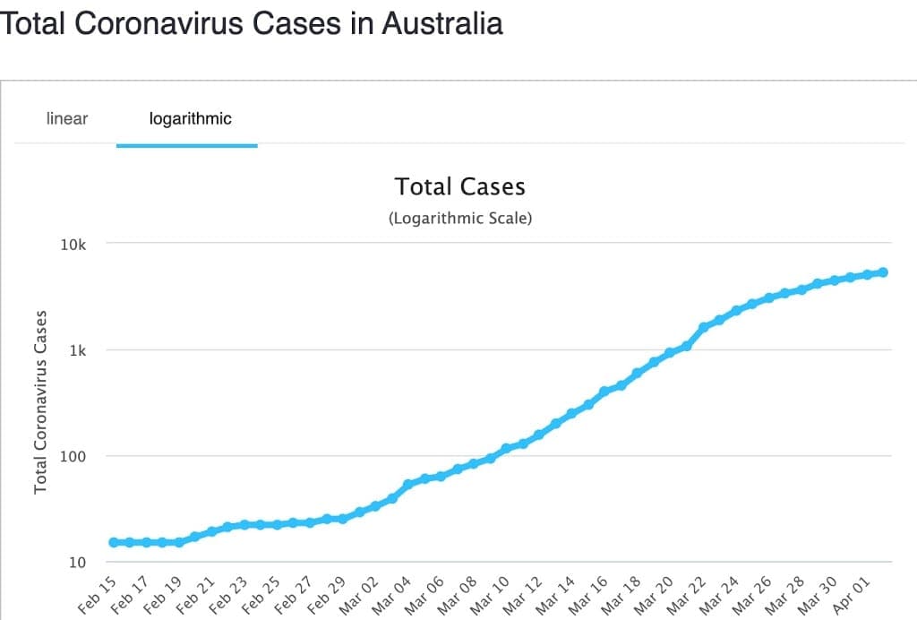
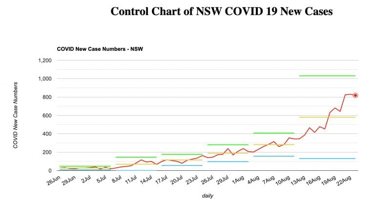
In Australia, our cumulative number of ‘cases’ appears to be flattening and possibly heading for about 10-12,000 cases. Our cumulative number of deaths was still tracking Germany’s – we are now about 17 days behind. If we have the next few days with fewer than 10-20 new deaths, we might have departed that curve as well. Yesterday, Germany had totalled 1,444 deaths. I’m am now hopeful that we can fall off Germany’s death curve as we managed to do for cases.
Comparisons
How many people die from the flu each year?
- In the US last year between 29,000 and 59,000 died from influenza. Another source says about 0.1%.
- In Australia in 2019, 3,732 were admitted to hospital with flu. Of those, 237 were admitted to ICU. 705 died. https://jglobalbiosecurity.com/articles/10.31646/gbio.47/
- Spanish flu of 1918 killed maybe 50 million deaths worldwide. The world had no ICUs available. Treatment was minimal. https://en.wikipedia.org/wiki/Spanish_flu
- Asian Flu pandemic of 1957 killed between one and two million people. Again, treatment was minimal. https://www.britannica.com/event/Asian-flu-of-1957
- Globally, the World Health Organization (WHO) estimates that the flu kills 290,000 to 650,000 people per year.
Testing
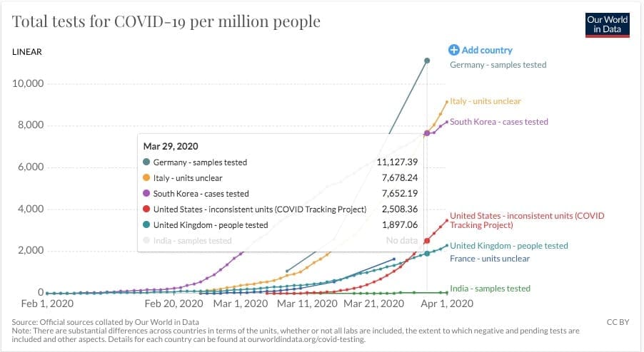
This very useful website is attempting to provide benchmarking for COVID-19 testing. The authors give a useful description of some unexpected pitfalls. For example, ‘Do reported numbers refer to ‘performed test’ or ‘individuals tested’. Given that suspected cases are tested several times and people in quarantine tested daily, the numbers can differ a lot. Some countries report ‘tests performed’, while others report the number of ‘individuals tested.’ The chart below shows numbers of tests per million people. I’ve highlighted 29 March because it is the latest data from Germany – whose data is recently included. To turn per million into a percent, divide by 10,000 – ie by 29 March, Germany had tested 1.1127% of its population. On the same day, Italy had tested 0.7678% of its population. A few days later, by 1 April, Italy had tested 0.9156% of its population. By 2 April, Australia had tested 1.0385% of its population. Although, given the warning above, ‘of the population’ might not be correct for any of those figures. Notice the very low figures for US, UK, France and India. Those countries know nothing of the people infected and who will continue to infect others.
Australia has different testing patterns for each state. In most states, this appears to be related to testing associated with know cases. Most tests are probably going to health care workers, clusters being investigated and those people in quarantine or isolation having tested positive and trying for a 2nd or 3rd negative test. I think Australia’s test numbers are very wonky. I’m going to be much happier when we have a random testing regime – announced today by ACT. Plus anyone travelling across state borders, crossing local government borders, anyone with a van or mobile home. Why? Stranger danger is a key here. Any one community will be extremely safe until the virus is introduced from the outside. The virus cannot get there by itself. Every new entrant must be tested and preferably quarantined.
This quote is from Canada but anecdotally it also applies in Australia.
I’m finally back in gear (I hope!) after three weeks+ struggling with what we’re pretty sure was COVID19. I was lucky to have not gone beyond the sore throat, heavy lungs, cough and extreme fatigue stages. Our fit, 43 yo daughter in Brooklyn had the same COVID symptoms, but with violent diarrhea and pneumonia too; but she is now well on the mend. Neither of us could get tested for COVID19 despite, in her case, having had to be taken to the ER for her pneumonia. Testing materials were scarce, both here and in Brooklyn, so tests were being strictly reserved for healthcare providers, clusters under investigation and for those who are to be admitted to hospital.
Canada, like the US, was sorely unprepared for the pandemic and thus is severely short of testing materials and protective gear for its caregivers. Also, under our Constitution, healthcare falls under provincial purview, so like in the US, the battle against the pandemic is decentralized, with the provinces foraging and competing for their resources and the federal government providing financial support and coordination as needed. But unlike the US, we didn’t have a denial phase; so we started testing earlier, may have had earlier, wider and slightly better cooperation among the general population and, thus, may, just may, be ‘flattening our curve’ a bit sooner than our southern neighbours. However, it’s difficult to tell for sure, because, with the lack of testing, our stats are woefully understated. Linda’s and my doctors each tell us that, based on their own practices, the disease is everywhere and much more widespread than our provincial authorities’ data imply.
A short aside on the Cruise Ships. I think the key question for each ship is ‘how did the virus get aboard’? Who was person number 1?
What do we know of the data?
I think we know very little. COVID-19 was declared a notifiable disease, which means that both cases and deaths must be notified to (I think) WHO. Sounds easy. However, every country interprets that instruction in its own way and for its own benefit. (The Economist also ran an article on this. You might need to be a subscriber to see it.)
Consider cases – if you don’t test, you don’t find – which keeps the number of cases lower than actual. Medical reports are showing a suspicion that 95% of people with the virus have no symptoms. However, each of them retains the ability to infect any person with whom they come in contact – each of whom may have a much more severe infection. The number of cases is certainly much higher than the published figures show. Many countries do not report the daily number of new cases as requested by the WHO. Italy was the first country to do this and for many days Italy’s data came with a warning. Italy was reporting the change in cases, calculated by ‘new cases less those newly recovered’. Many countries began to copy this method as it made their data look better. So that number is very wonky.
Counting deaths. Surely, this is a much more accurate figure – dead is dead, surely you just have to count the bodies. But, what did they die of (and where did they die). It is probable that the WHO wants everyone who ever had a trace of COVID-19 in their system to be recorded as a COVID death. But did COVID kill them? We don’t know. COVID probably did cause the pneumonia or heart failure that did kill them. But, it might have been their untreated cancer, diabetes or stroke. It also turns out that some countries will only count a death as a COVID death if it happened in hospital. (See France above.) If that death happened at home, it is not included. Nor will it be included if the person died before they could be tested. So, the number of dead is also wonky.
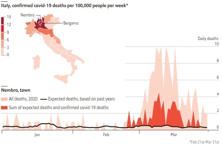
The graph left shows research published in The Economist for Nembro in Italy. The black line running across the bottom of the graph shows the long term average of deaths for the town. Red sown deaths attributed to COVID-19. Pink shows other deaths. Other, non-COVID deaths is clearly showing an anomaly. This finding is repeated for towns across Italy and Spain. The Economist concludes “the official covid-19 count will always seem too low in places like Nembro, a Bergamasque town of 11,000 people. It suffered 152 deaths in March, with only 39 attributed to the virus so far. “Almost all the old people got it,” says Luca Foresti, a researcher. “And therefore they died, a lot.””
Numbers of tests, cases and number of deaths are unreliable, poorly measured statistical variables for which the stated value for any country for any day is at best an ‘approximation’ of the actual value. We can expect many PHD thesis to be written about these variables
Death Rates
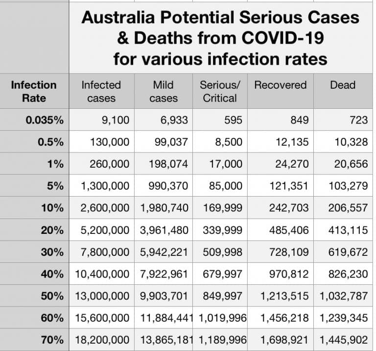
When we look at the rate of death per number of cases in different countries, we see very different values. On 2 April 2020 – US 3% and rising rapidly, Italy 13.5%, France ∼9%, Germany 1.3% and rising. Does this mean that there has been a different virus in each country with its own special kill rate, or do the citizens in each country have different natural resistance to this new virus. Not likely. Or, is health care in the countries listed above so different as to give those different outcomes. More likely as countries become overwhelmed. Certainly death rates per infected case has rapidly increased each day. So, the death rate per case is also suspect. [Also, we don’t know the death rate for the population as a whole, nor for any subsets – age, sex, previous diagnosed health issues (heart, blood pressure, diabetes, smoking, alcohol, etc). More research for statisticians to rub their hands over.]
What did China do?
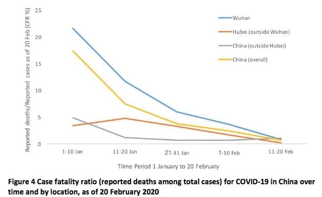
I was struck by the difference between the death rates above and China’s. China has just 4.1% deaths per infected case. A trivial number compared with Italy, France and most Western Countries. (For the moment, I am taking China’s data at face value. China might be exaggerated to make a point, but the data was published long before the west headed off on its current path.)
- China began its path in early December 2019 – hence the 19 as part of COVID’s name. I know the west continues its criticism of China’s ‘slow response’. That ‘slow response’ is nothing compared with the feet dragging and denialism that has happened in the west.
- By about 22 Feb, China’s new cases had stabilized. Deaths stabilized by 11 March. (The rest of the world stood by with its hands on its hips watching while China managed its outbreak. Italy had its first unquarantined case on 6 Feb.

China’s Reduction in Deaths per Case Ratio with time France on 24 January. Germany on 27 January. I could argue that the rest of the world squandered the 3-6 weeks of warnings coming from China. Little in the way of preparation for what was coming until cases began to appear in each country.)
- China has attempted to help the west learn from its experience in dealing with COVID-19 (or SARS-COV-2 as it is also called because it another SARS outbreak).
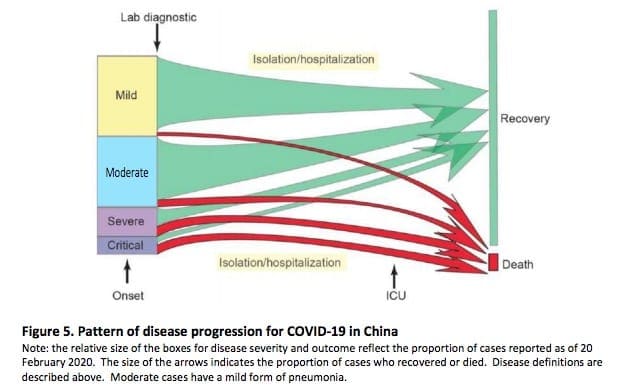
China’s attempts to keep as many as possible
on the green paths and minimize red pathsThe following three documents are examples from a simple Google search.
- Hangzhou Zhejiang Government Response. The Six Lessons. I’m impressed that each person in Hangzhou has to take their temperature each day and send that record to a government database in order to retain a work permit. I can imagine the outrage if Australia introduced this when it begins to reopen shopping, cafes and restaurants – ‘to be allowed to go to work each day you must send your temperature each morning to the CentreLink database. Your temperature will be taken several times each day while you are at work. If your temperature is more than 37ºC you will be tested for COVID and sent to isolation.’
- WHO’s China Joint Mission on COVID-19 final report published about 24 Feb. The graphs above right are from this doc. It is very readable. Findings page 27+. Recommendation page 38+.
- Handbook of COVID-19 Prevention and Treatment. This is an excellent and detailed document translated from mandarin describing keeping hospital staff free of the virus, diagnosis and identification of various stages of infection, treatment.
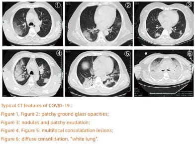 |
| CT images of the six stages of COVID-19 |
We may never know what the most important things that China did to reduce it death rate. It does look to me that very early treatment may have been the key. China quickly began a program of testing. People testing positive were immediately sent to hospital and treated. Treatment depended on CT imaging (see images left). Very mild cases were treated with antivirals (see doc ‘c’ page 24). The intention was always to prevent the case getting to a more severe category.
In most western countries, early mild cases are sent home for ‘self-isolation’. We miss the chance to treat it early and only begin treatment is the person has progressed to ‘more severe’. We miss the first 14 days of treatment – treatment when the disease might still be mild. Certainly, many of those cases stay mild and never escalate – but many don’t stay mild and go on to severe and death – and overwhelm ICUs and the health care system. Perhaps the learning is to ‘treat cases early to keep them away from ICU and ventilators’.
Why has the west ignored the hard won advice from China? Are we so arrogant that we won’t even consider advice that could save the lives of thousands.
Easter
This christian religious festival is due this coming week end. At present, the Australian government is intending to relax social distancing and numbers in groups regulations so that more people can attend Easter gatherings. Look for a surge in cases from about 24 April and deaths from 30 April.
Tracing
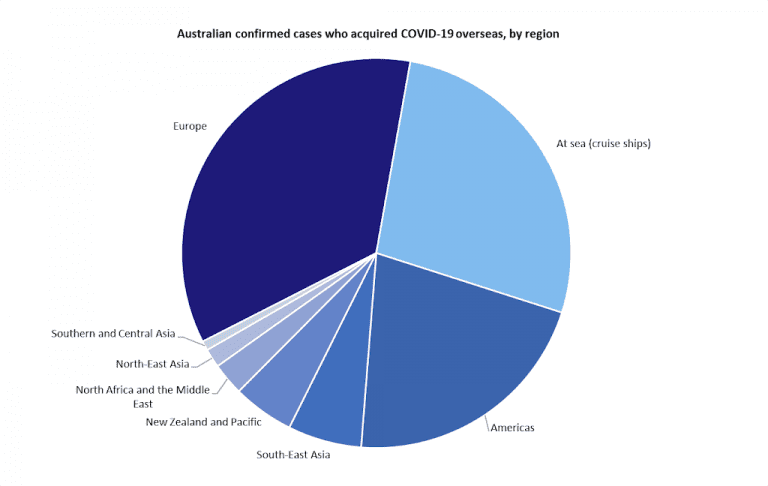
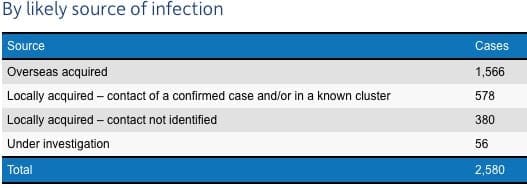
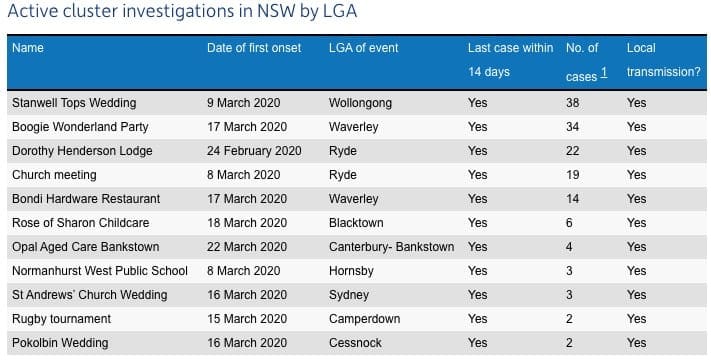
Australia has been doing a good job at ‘Contact Tracing’ – tracing down from where every new case acquired the disease. The table above shows Contact tracing from NSW. Hover, about 17% are ‘unknown’. The table below shows the major identified clusters from NSW – 38 from a single wedding, 19 from a church meeting. That Aspen Ski Trip Cluster (multi-state) gave Australia at least 9 cases who refused to self-isolate after returning to Oz. The ski trip that keeps on giving.
What have the Bells been doing during our lockdown?