COVID NSW lockdown
In reverse date order
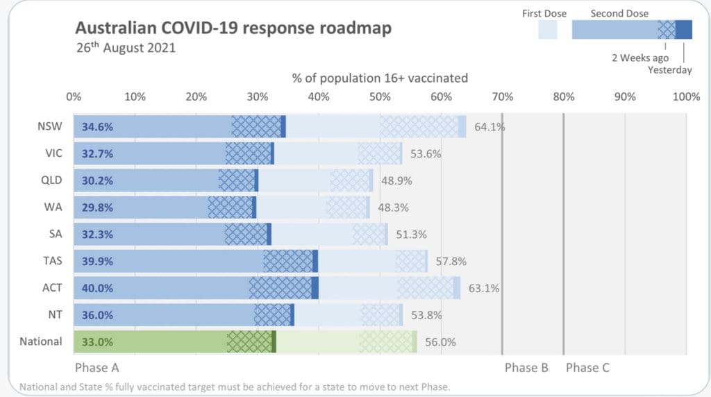
You can always find the latest Control Chart graphs here. (Vaccination numbers don’t come through until after 5pm.)
For the graphs in the link above, the series exponential in the first few graph is scary and is getting the most attention. Also the number in hospital should be close to zero and will be the main indicator once enough of the population is vaccinated. Unfortunately, the two charts on ‘cases under investigation’ and ‘cases unlinked after investigation’ both show Contact Tracers are swamped – or else the data might be meaningless. The last graph (Infectious in the Community) was initially said to be the most important and would drive decision making. Initially, it was said that this graph should be zero or close to zero before lockdown will be eased. This data is no longer being reported.
Click here, for graphs on days until states reach vaccination milestones.
19 Sep 2021. Day 36. The NSW numbers over the last few days are very encouraging. New cases appear to have peaked and appear stable. Ditto for hospital and ICU numbers – indicating that, at least for now, hospitals are coping. Other numbers are not so good with contact tracing still having exponential growth and vaccinations appearing to have fallen into a hole.
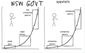
10 Sep 2021. Day 27. Today, Gladys announced that she would no longer attend the 11am press conference – she had ‘more important things to do’. I think this was very bad judgement. At the press conferences, Gladys had two major jobs: to say ‘we are all in this together’ and ‘get vaccinated’. So far both have been effective. People galloping to get vaccinated. Now, she has told us that is too much trouble and is keeping her from her more important work. Bad decision.
On the other hand, the numbers are looking better today. The number of new cases is beginning to lose its exponential look as is the number in hospital. Other numbers: ICU, Ventilators, not so good.
27 August 2021. Day 13. I’ve spent the last couple of days on new graphs. Namely, days until each of the states is expected to reach 70% and 80% vaccinations for first and second doses for populations ≥ 16 and (because I thing the states will push for it) ≥ 12. Having spent two days on it dbRaevn posted a better version on Twitter 45mins ago. Better because he/she has included the 2 weeks it takes for vaccines to be fully active.
Numbers for today look better-ish, expect hospitals are getting a hammering. I strongly suspect that the money push from the cynical Federal government will have everything open up at 70% and let the hospitals drown. At time of writing this (3:30pm), numbers are not available to 3 of the numbers that have looked very wonky to me – ‘not isolated’, ‘being investigated’, ‘investigated but linkage unknown’. These numbers have never made sense. I’m not going to be surprised if they are dropped.
24 August 2021. Day 10. I added a few more series to the charts screen. Notebly, REFF number – the effective number of people each infected person infects. I spent some time trying to find information on NSW COVID Clusters. I cannot find anything published. I notice that Jerome in Victoria reports on Victorian Clusters each day. NSW Health does not publish such information that I can see.
23 August 2021. Day 9. Today’s numbers are similar to the previous few days. The chart to watch at the moment is the ‘number of unknown cases’. It appears to indicate the contact tracers are swamped.
The chart below is another from dbRaevn from twitter. Updated 5 Sep
22 August 2021. Day 8. I’ve added two new charts today. Neither look good at all. I’ve added ‘Number of Cases Currently Under Investigation to Find Links to Known Cases’ and ‘Number of Locally Acquired Cases that Could NOT be Linked to Any Other Case – after Investigation’. Both have exponential growth and clearly show the Contact Tracers are not coping. We need a bucket load of more Contact Tracers.
21 August 2021. Day 7. A much worse day all around. The dip in the numbers yesterday has been countered with an increase in all numbers today. Cases and hospitalisations are clearly “out of control”. We are not heading for a good place.
20 August 2021. Day 6. A more positive day all around. The numbers did not continue climbing as disastrously as before – though that might be just a blip.
19 August 2021. Day 5. No significant change. Number infectious has stayed constant. Cases, hospitalized and ICU are climbing. The good news is the constant plod of number infections. It has not gone up – although, neither has it gone down.
18 August 2021. Day 4. A few links to well put together data.
- Tracking Australia’s COVID vaccine rollout numbers
- Charting the COVID-19 spread in Australia
- Find the facts about COVID-19
17 August 2021. Day 3. Today’s data show that not much has changed. As well as the Control Charts that you can see at the link above, the bar chart below shows the ‘COVID cases by age group and sex’ as of 16 Aug 2021. This chart clearly shows that the age groups with most identified infections are between 20 and 39. Delta does not appear to be a virus that only attacks the older population. This virus goes for the young.
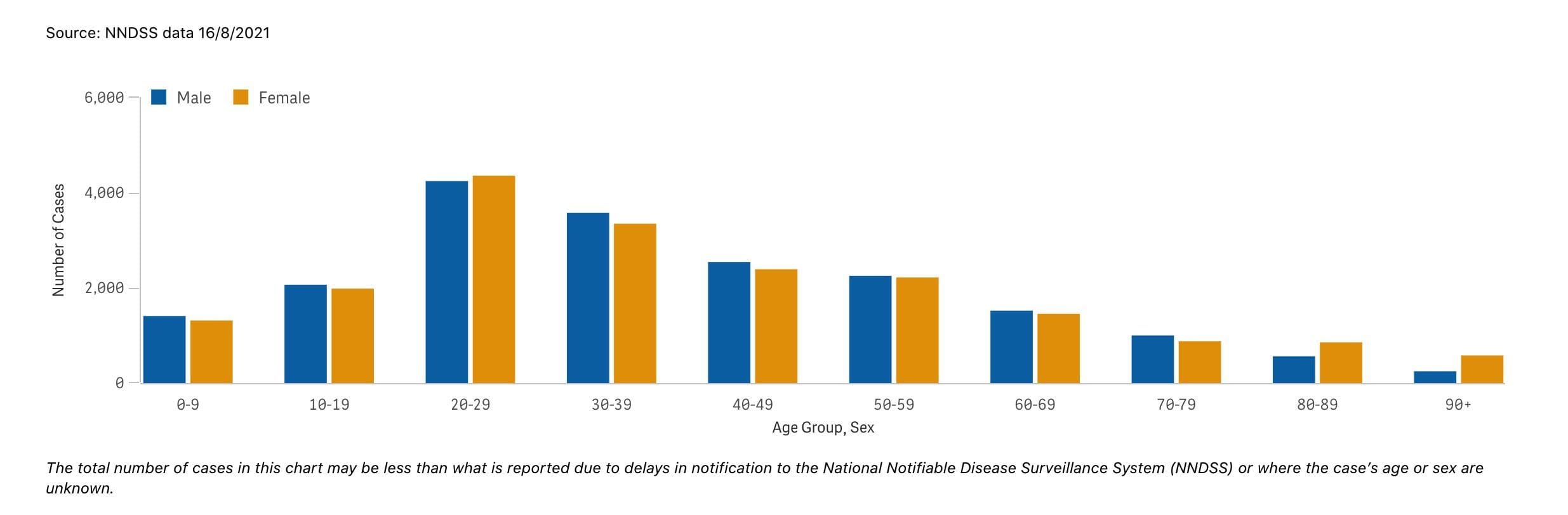
This graph shows the number of COVID-19 cases for males and females by age group since the first case was reported.
Click on the graph for the latest data.
The code that I use for the Control Charts has a history. It was first written in C++ by Yameng Chen who worked for me at NSW Cops during the 1990s. She gave me the code when I left and I ported it to php in the early 2000s for netgm. I’m now using those same php functions in these calculations and added graphing using Google Charts.
16 August 2021. Day 2. I’ve added 7 new control charts – Number in Hospital, Number in ICU, Number on Ventilators, Number of Tests, Number of Vaccinations, Number of Deaths, Number NOT Fully Isolated While Infectious. Each has something to tell us. I intend to update these every day at this link. (Charts will be updated daily before about 12 noon, except for the vaccination chart which will be updated hopefully before 7pm.)
15 August 2021. Day 1. NSW locked down all Regional NSW at 5pm on 14 August 2021. That morning, Premier Gladys Berejiklian announced 466 new case numbers. The outbreak that had been running in SW & S Sydney had broken out in Dubbo and NW NSW over the previous few days.
Helen and I had been closely following the 11am NSW Press Conference each day. I even had an alarm set so we would not miss it. I had been using a Kalman Filter forecasting program to forecast the number new cases for the next day. However, the series of daily new case numbers had grown more and more like an exponential series. The Kalman forecast for the 14 Aug looked like this.
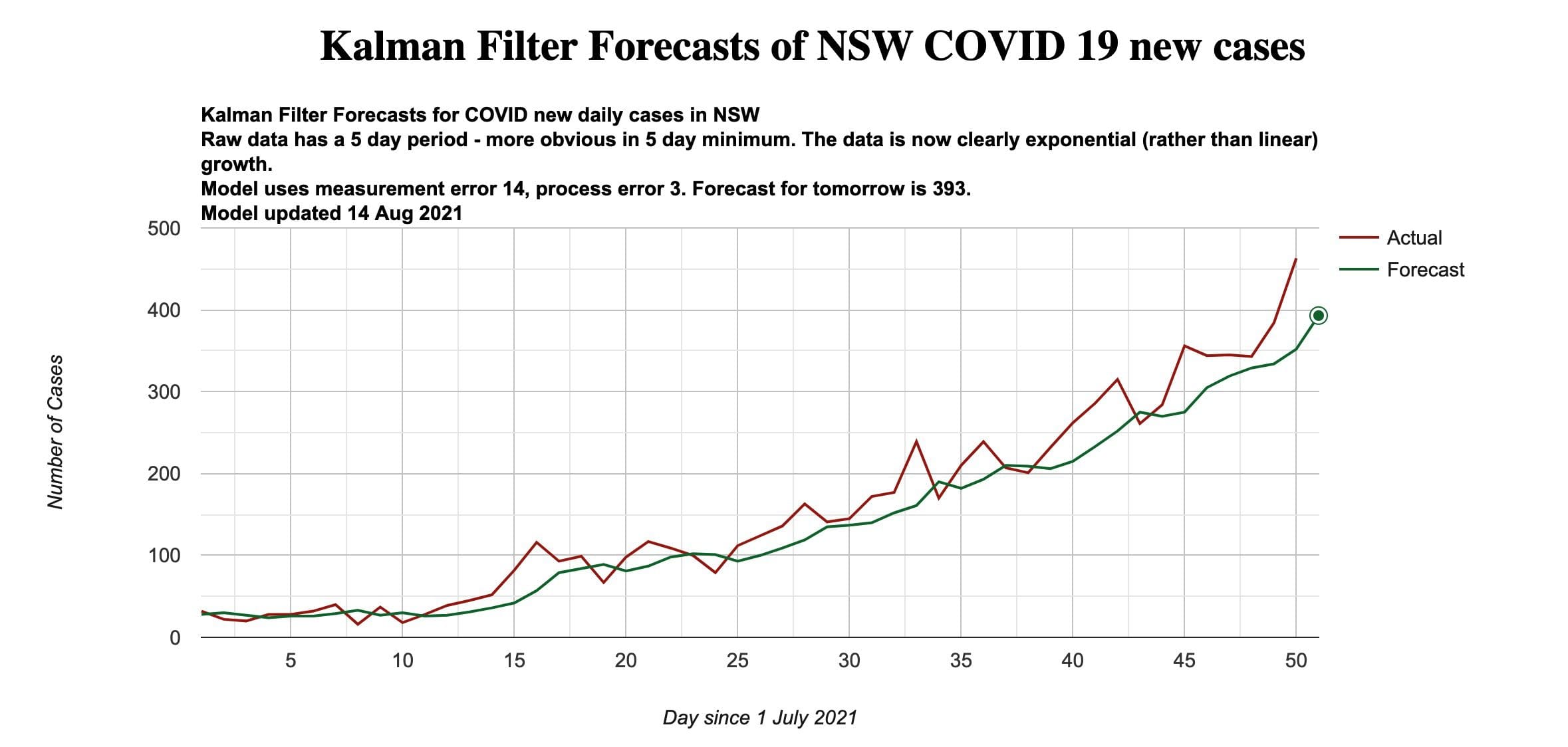
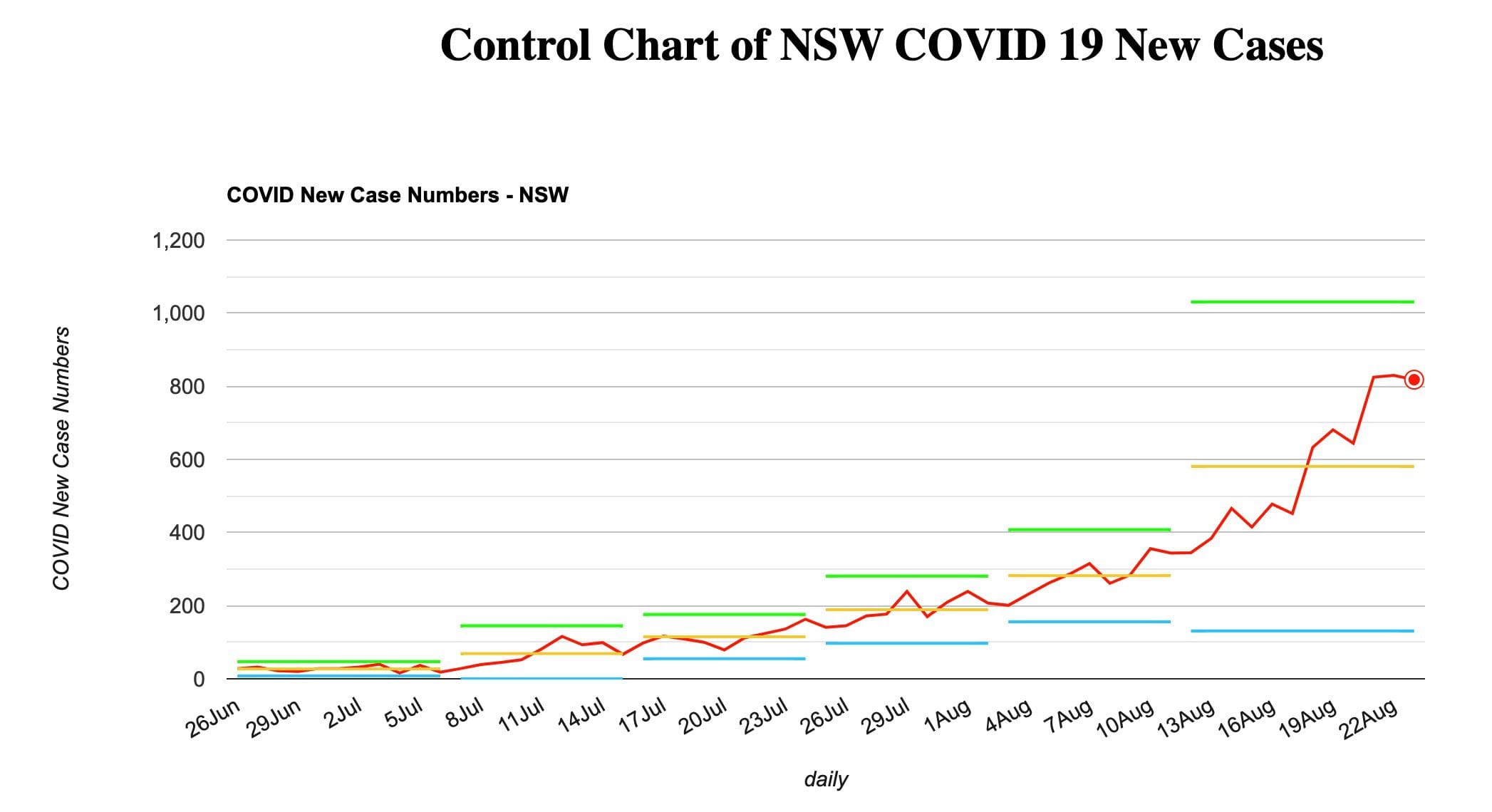
This series is now clearly exponential. I decided to see what Control Charts could tell us. Below is the Control Chart for the series to and including 14 Aug 2021.
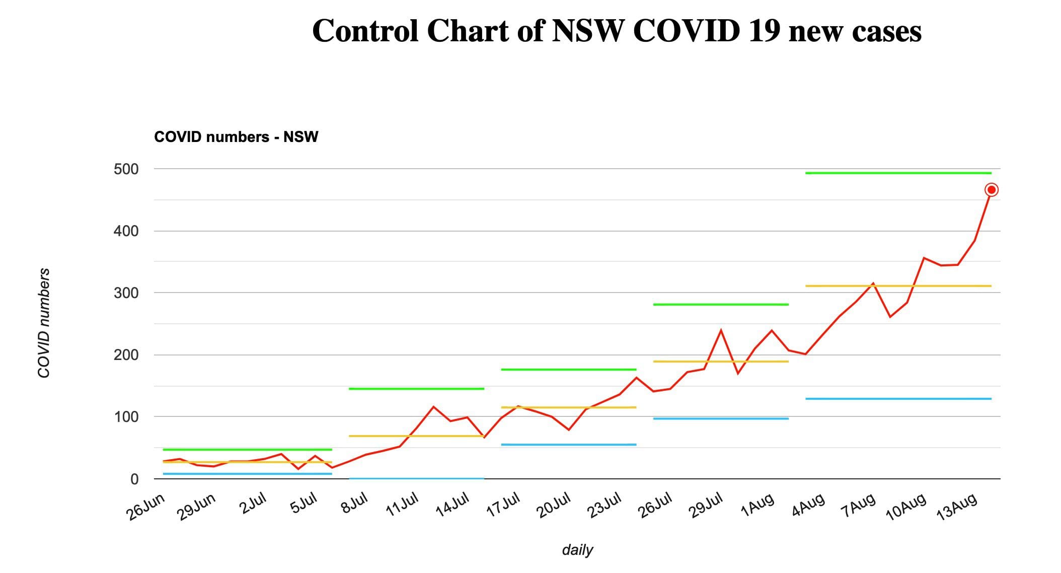
My Observations at this time are:
- This data shows a system seriously out of control.
- The data is exponential.
- It is never in control after the first few days.
- The average lines yAv (yellow) increase every week or so.
- The variance [spread between yTop (green) and yBotom (blue) for each set of Control Lines] has markedly increased – showing that the system is increasingly out of control.
- Expect the next data points to be saw-toothed higher.
- We cannot expect the series to decrease until it is stable and in control.
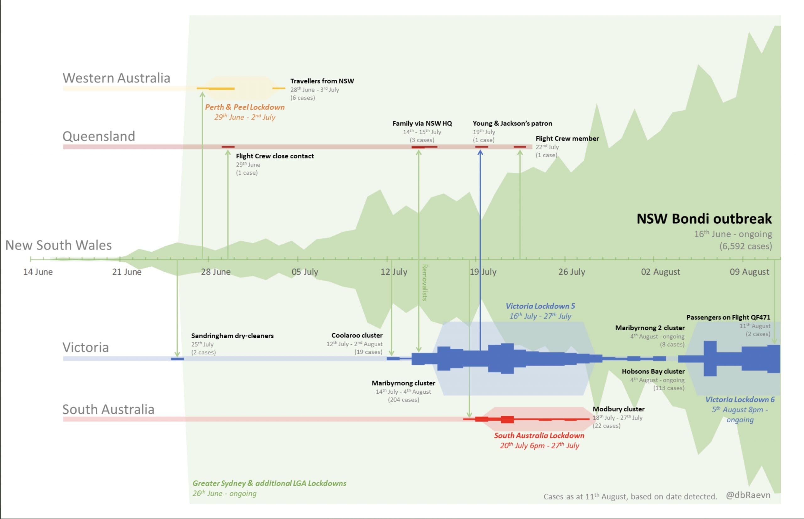
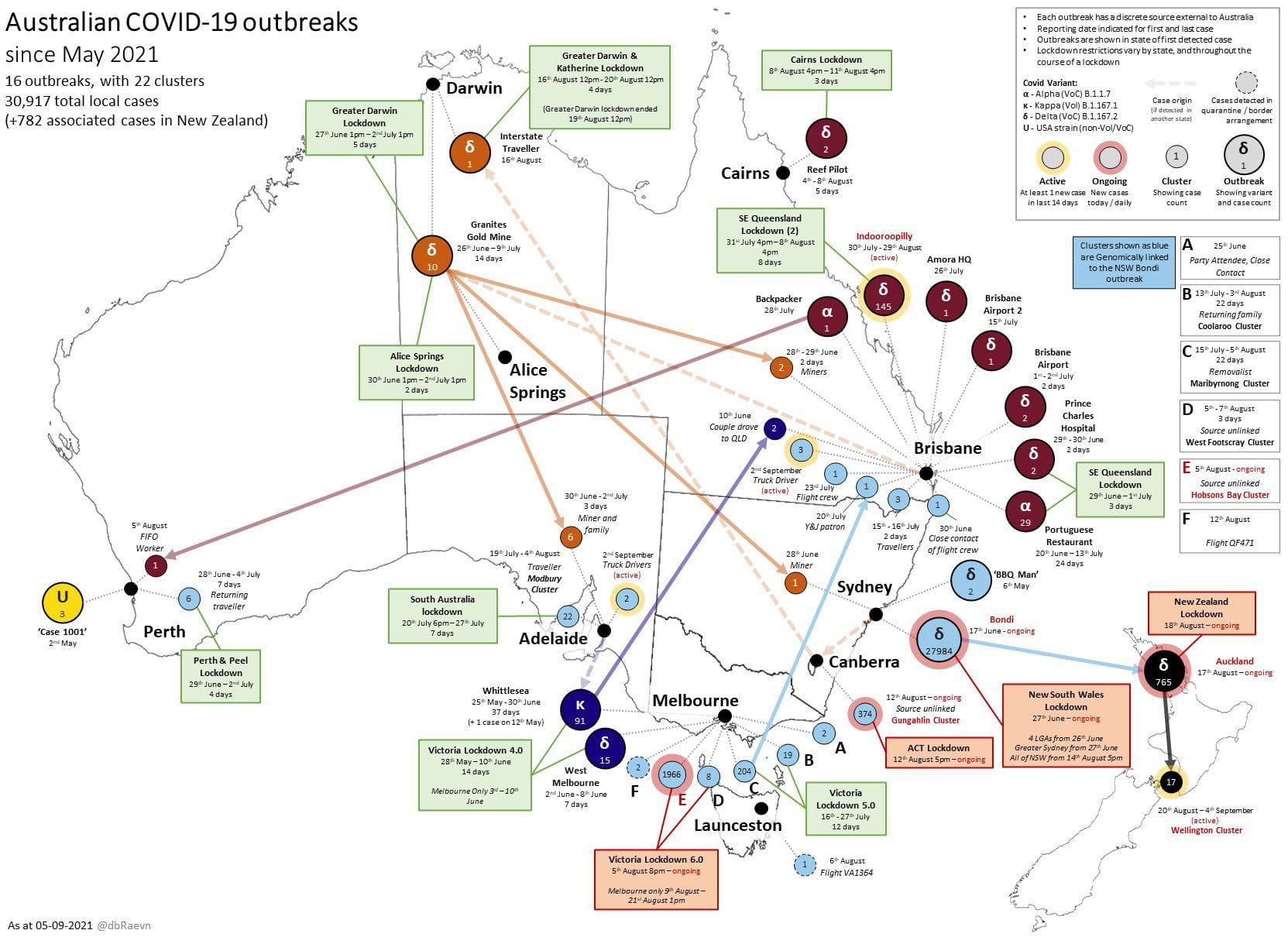
This pix was published on Twitter by @dbRaevn on 13 Aug. It shows an excellent graph of the outbreak to 11 Aug in NSW and its spread to other States.